Publisher growth tactics for election season | WEBINAR


2.3.1 What Is Page Experience?
Page experience is a set of signals — including Core Web Vitals (CWVs), mobile-friendliness, HTTPS and intrusive interstitial guidelines — that Google uses to extrapolate user experience on a website.
Page experience is an evaluation of a site’s performance rather than its content. While Google still prioritizes content relevance when answering user queries, page experience is effectively a tie breaker when several sites offer a similar level of coverage.
The four page experience signals are:
CWVs measure user experience by focusing on how quickly a page loads, its responsiveness to user input and also its visual stability. There are three metrics for this:
Google’s April 2015 update introduced the search giant’s mobile-friendly metric, which boosts the ranking of mobile-friendly pages on mobile SERPs.
Effectively, Google will prioritize those sites that ensure their content is easily readable on mobile devices — meaning there’s no need to zoom, touch targets such as login buttons are not spaced too close to one another, there’s no horizontal scrolling and unplayable content is avoided.
The update applies to individual pages, not entire websites, and also doesn’t affect content that is viewed on desktop/laptop browsers.
HTTPS, or hypertext transfer protocol secure, is a secure version of the HTTP internet communication protocol.
HTTPS, or HTTP, forms the first part of every URL that is known as the “scheme”. This comes before the domain name, which is the segment of the URL known as the “authority”.
The difference between HTTPS and HTTP is that the former is secure while the latter is not. What this means in practice is that users logging into a site via an HTTP connection send their personal details in unencrypted plain text.
HTTPS secures that connection, meaning any data sent between the user’s browser and the website’s server is encrypted along the way. Sites that desire secure connections need an SSL certificate, which the user’s browser checks and verifies.
Interstitials are a mobile only ad format that only appear in natural breaks in the content — such as when a user moves from one article to the next — covering the screen in the process.
Interstitials are viewed as intrusive when they block or partially obscure a users’ view of the content. Dialogue boxes on mobile websites that behave similarly also fall under this category.
Most publishers’ strongest skill sets tend to be content creation, publishing and marketing, leaving little room to both understand and optimize the various page experience pillars.
Finite resources mean publishers will struggle to justify the time and money needed to dig into the backend of individual web pages, let alone an entire website.
Even if publishers are able to devote time to tackle the problem, as we can see from above, page experience is a multifaceted issue that requires a holistic approach to deliver meaningful performance gains.
Knowing which of the four page experience signals to start working on can be a headache in and of itself.
Page experience is incredibly important for publisher SEO, as great content is not enough to guarantee top placement within the SERPs.
Google still values the best information before anything else, meaning unique content or news “scoops” will perform well even if the page experience is “subpar”. However, in cases where several publishers provide excellent topical coverage, page experience becomes an important deciding factor influencing SERP rankings.
Each of the four page experience pillars has a different impact on a website’s SEO. The most immediate impact comes from focusing on CWVs, which will translate into a website that loads faster.
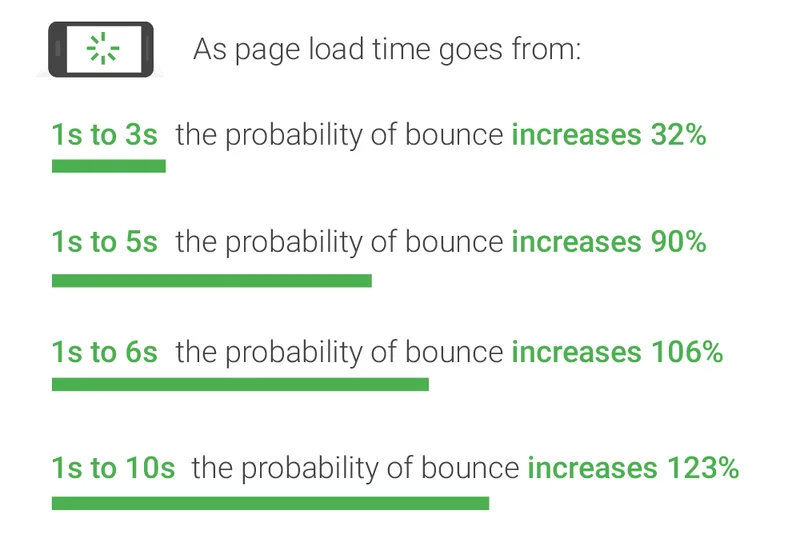
Numerous studies have shown that the longer a website takes to load, the quicker the audience loses interest and the higher the bounce rate becomes.
For example, a Google study from 2018 found that bounce probability jumped 32% when page load times climbed from 1 second to 3 seconds.
Another Google study from 2020 found that news sites that passed the CWV test saw a 22% lower abandonment rate than those that failed. Yahoo! JAPAN, meanwhile, improved its CLS score by 0.2 and saw a 15.1% uptick in page views per session and a 13.3% increase in session duration.
While Google has said explicitly that it doesn’t use bounce rates as a ranking signal, a high bounce rate speaks to factors Google does care about — namely a page’s load speed, responsiveness and visual stability.
Publishers targeting audiences on mobile devices need to ensure their site sends mobile friendly signals that both Google and Bing can pick up on. Both search engines will prioritize friendly websites when delivering search results to mobile users.
Compared to CWVs and mobile friendliness, implementing HTTPS will have a much smaller impact on a publisher’s SEO. Google said in 2014 that it would use it as a ranking signal and started marking all HTTP sites as “not secure” in Chrome in 2018. However, the biggest benefit here is enhanced data security, especially if your business module is based around subscription revenue.
Intrusive interstitial ads or dialogue boxes, meanwhile, can limit web crawlers ability to crawl and index a page, preventing search engines from even being able to rank it, leave alone featuring high in search results..
The first step towards improving page experience begins with evaluating your website’s current effectiveness.
There’s a wide array of first and third party tools to achieve this but, for this guide, we will look at Google’s first party tools.
We now know that CWVs are an important ranking factor. But how are they measured? The table below lists the parameters within which optimal CWV numbers should fall for the best page experience.
Now that we know what we need to measure and by how much, we can look at how to go about measuring page experience.
Below is a list of some of the most commonly used methods.
The first option open to publishers is by far the most technically challenging and isn’t one we’d recommend even considering unless you have a good developer to assist with its implementation.
We’re talking about gathering user data from your site, a process known as real user monitoring (RUM), and then analyzing the results within Google Analytics 4 (GA4). Google has other tools, such as PageSpeed Insights (PSI), that use data sampling to evaluate your site. But if the goal is to have a complete user experience picture for your website, then you need real-world data gathered from your site.
We advise using GA4 for this task for the simple reason that Google intends to begin “sunsetting” the previous generation of Google Analytics, Universal Analytics (UA), from mid-2023.
As a publisher you should have already set up a GA4 account in anticipation of the switch over. If you haven’t, then please follow Google’s guides on how to either set it up for the first time or how to add it to a site that already has UA.
Once that’s done the next step is to link Google’s BigQuery data warehouse to GA4 from Analytics Admin. Linking BigQuery will allow you to query your data using SQL. Here’s a guide on how to link the two.
With those steps out of the way we can now add Google’s web-vitals library to your site.
The library, which is an extremely small modular JavaScript library for data collection, is available on GitHub.
The library can be installed either from the open-source npm online repository by running “npm install web-vitals” in your command terminal or via <script> tags on a content distribution network (CDN).
Here’s an example of such a script:
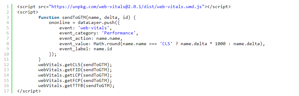
Once the web-vitals library has been installed, user data can then be sent to Google Tag Manager (GTM), using a Google-recommended custom template tag that Simo Ahava created and maintains.
Once the tag has been installed, the CWV metrics and associated attribution data can then forward it to GA4.
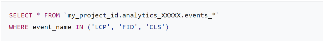
Once you’ve set up analytics to track the GTM data, you’ll be able to see event data in the BigQuery interface. This data can then be queried like so:
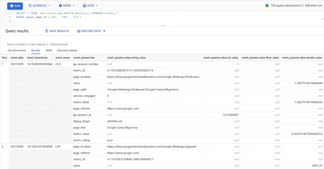
Once the query is returned, the report should look something like this:
We really have to stress again that this is a developer solution and is, in fact, a good deal more complex than this. However, adopting this solution will give you the most accurate read on your website’s performance.
For a more detailed explanation of this process, check out Google’s guide to viewing CWVs in GA4.
While this is the most accurate approach to monitoring CWVs, there are simpler approaches to tackling this problem.
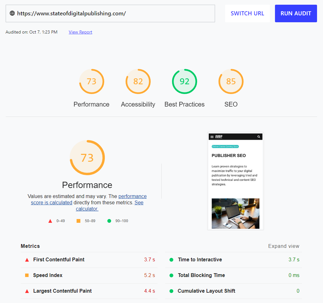
PSI is less accurate than using a GA/RUM approach, however, it’s frequently cited as one of the most important tools with which to measure CWVs — thanks to the tool’s ease of use.
While it may only use samples of real user experiences taken from the Chrome User Experience Report (CrUX) over the previous 28-day period, PSI provides a simple and easy to understand user interface. This means interpreting the data is a much simpler process.
As you can see in our example below, examining Forbes’ site immediately provides a wealth of information into both the publisher’s desktop and mobile website.
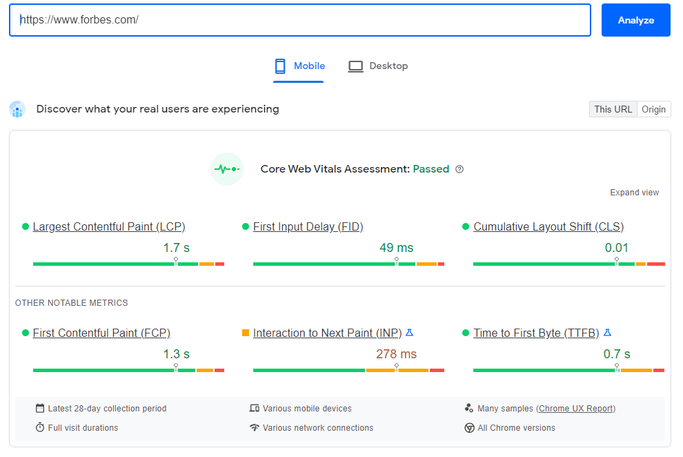
PSI uses the green, amber and red categories from above when assigning Good, Needs Improvement and Poor performance grades.
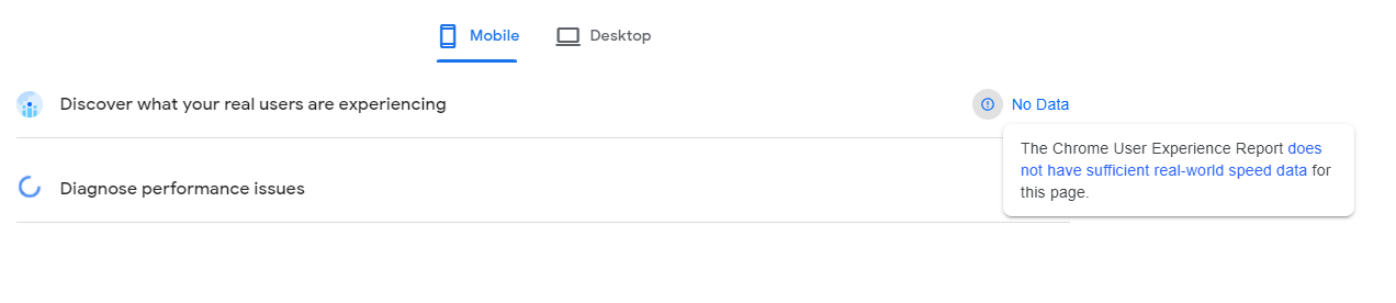
CrUX’s sampling approach means that while the above assessment of Forbes took in some real world user experiences of the site, it can’t factor in all of the site’s user data.
This sampling approach becomes problematic for smaller sites, many of which won’t feature in CrUX’s field data.
However, PSI can still offer a virtual diagnosis of your website using lab data pulled from Google’s open-source Lighthouse tool. See the below example: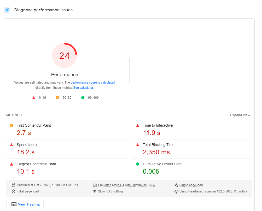
The problem with this approach is that Lighthouse collects its data using predetermined device and network settings, which will not reflect your users’ settings. This means it is a poor substitute for the real thing.
GSC is a tool that’s designed to provide publishers with a bird’s-eye view of their website’s CWV issues, opening the door to a holistic approach to improving the site’s performance.
It does this by grouping its URL performance reports based on status, metric type or topical similarity. It does not identify issues with individual pages, denying the opportunity to implement fixes on a granular level.
This is where PSI comes in. It’s worth noting, though, that PSI’s individual page report may differ markedly from the GSC’s group results. That’s because the individual page is just one component of GSC’s aggregated group results.
Logging into GSC’s dashboard, users will see the Core Web Vitals tab on the left-hand side. Clicking on this tab displays separate mobile and desktop CWV reports for URL groups.
Despite there being three CWV metrics — LCP, FID and CLS — URLs will receive an overall grade based on their worst performing metric for a specific device which will also affect the group reports.
For example, if a URL on mobile receives a Poor FID and a Good LCP, it will be labeled as Poor on mobile.
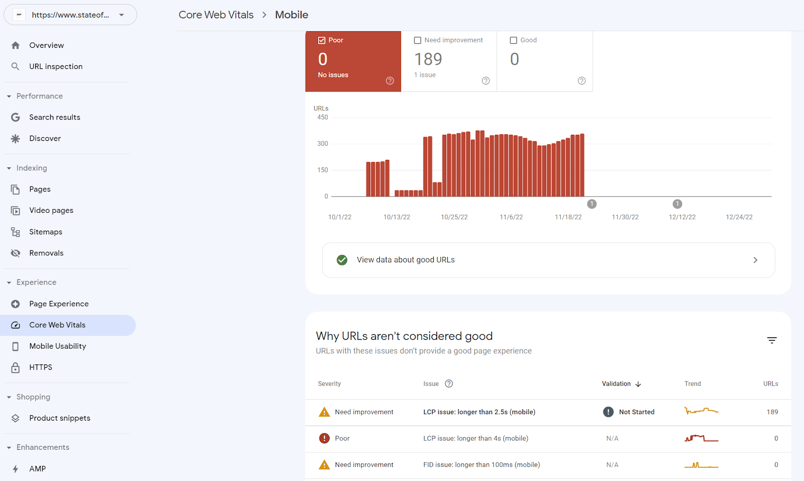
Again, it’s important to note that GSC is not meant for granular fixes. However, it is great for publishers that have lots of similar pages. For example, news sites may have a relatively standard design and layout for their article pages that uses an image as the largest element above the fold. In this case, GSC can quickly help to identify LCP problems across a range of URLs.
The final tool in the Google performance measuring toolkit is Lighthouse. This tool is completely different from those that came before in that it emulates user performance based on an established set of parameters.
It does not use field data and so is more limited in terms of practical uses. For example, field data is influenced by a user’s network connection and their distance to the site’s servers, whereas Lighthouse emulates a mid-range device to collect data within a controlled environment.
It’s also important to understand that Lighthouse’s score is not just an amalgamation of CWV scores. It excludes FID, since lab data by its nature excludes end-user interactions, while adding total blocking time (TBT), speed index (SI) and time to interactive (TTI) metrics into the mix. For those who want to simulate an FID experience in the lab, TBT can be used as a proxy.
However, we’d recommend against using Lighthouse as a primary measurement resource. Rather it should be used as a companion tool alongside PSI to help troubleshoot specific page issues.
Publishers that do wish to use Lighthouse in their testing can do so via Chrome Devtools which are baked directly into the Chrome browser, an extension for said browser or at web.dev/measure.
Lighthouse will audit your webpage and provide scores out of 100 on four areas:
Here’s what it looks like when we put our homepage through the web.dev option.
Mobile web design differs from traditional desktop web design in that mobile devices have smaller screens, generally sport less powerful hardware and rely solely on touch inputs.
Mobile friendly sites prioritize user experience by following a set of best practices which we’ll explore a little later. For now the best way to check whether your pages are mobile friendly is with Google’s Mobile-Friendly Test.
Entering a URL of a mobile friendly web page returns the following result:

Pages that fail this test will show up with a number of fix options to pursue. We’ll get into those a little later on.
Checking whether your website has a secure connection is an extremely simple process, involving opening your browser and looking at the symbol to the left of the URL in the address bar.
In Chrome a secure connection will be denoted via a closed padlock symbol like this:
An unsecure connection will have a Info symbol like so:
Determining whether your interstitial ads are intrusive or not is not as simple as entering your website into an online tool and waiting for it to return a tick or not.
It requires studying the interstitial ads and dialogues boxes on your site and deciding whether they pass certain parameters.
Think of these parameters as questions, for example:
If you answer yes to any of these questions, it’s probably an indicator that the ad or dialogue box is intrusive.
Now that we have a firm grasp over the different components of the four components that count towards page experience, as well as the means to monitor their performance, let’s move on to exploring how exactly we can boost our sites’ ranking signals
We’re going to look at CWVs first, as debugging and optimizing LCP, CLS and FID will have the biggest impact on your ability to compete for top spots in heavily contested SERP rankings.
While mobile friendliness is incredibly important for sites targeting mobile users, improving CWVs will boost page performance for sites regardless of whether they’re viewed on mobile devices or desktop.
Tackling HTTPS and intrusive interstitials have been left to the end as they’re easier and less rewarding wins.
There are a number of options when it comes to improving CWV performance, which we’ve broken down into order of the importance we believe they merit.
Optimizing the Core Web Vitals of any page is a spectrum of actions and it’s important to know where to start to maximize your resources.
As we’ve already noted above, largest contentful paint (LCP) measures how long it takes to fully load the largest text or image asset visible above the fold.

Use PSI to Identify which page content triggers the LCP test, by heading to the report’s diagnosis section and clicking on “Largest Contentful Paint element”. Here’s what we saw from on SODP’s homepage: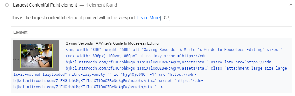
A poor LCP score can usually be narrowed down to either slow server response times, render-blocking JavaScript and CSS, resource load times or client-side rendering, or even a combination of all four.
Optimizing your page actually involves optimizing four different subparts of the LCP load process:
All of these steps must be optimized for you to see an improvement in your LCP score. However, it doesn’t mean all of the sub-parts are equally important.
Google has suggested total LCP time should be broken down with TTFB and resource load time each accounting for around 40% while resource load and element render delays should each account for less than 10%.
Ideally, these last two should be as close to zero as possible and take priority over the other two phases.
There are two ways to help slash the resource load delay as close to zero as possible:
We’ll say this straight away, we recommend consulting with your web developer before diving into these fixes. This is a backend operation and requires an experienced hand to make it work as desired.
Resource discovery
Every web browser comes with a preload scanner, whose job it is to assist the browser’s primary HTML parser in detecting page content.
While the primary HTML parser processes raw markup until it runs into a blocking resource — such as a script that doesn’t contain an async or defer attribute, the preload scanner occupies a more speculative role.
In other words, the preload scanner is looking for resources to fetch before the primary HTML parser reaches them and continues to work even if the parser is blocked. The preload scanner can be used to find and load the LCP as close to the initial page request as possible.
To ensure the LCP resource is discoverable from the HTML source, developers have asset specific options.
For example, if the LCP is an image then its src or srcset attributes need to be present in the source code. CSS background images, meanwhile, can be preloaded by including <link rel=”preload”> in HTML markup or in the header. Finally, fonts can be similarly loaded via <link rel=”preload”>.
It is worth noting, however, that using preloading to cut down on LCP load times can introduce new problems into the mix, such as deprioritizing async elements. There’s a reason we advocate talking to your developer about this.
For more information on this subject, check out Google’s deep dives into both LCP optimization and the preload scanner.
Resource priority
Browsers try to download CSS, font, script, image and iframe assets as optimally as possible by assigning priority. Browsers are excellent at figuring out asset priorities, but that doesn’t mean they are flawless.
To optimize asset prioritization, developers can use markup-based Priority Hints to signal to browsers which assets have a higher priority. For example, a developer can use JavaScript and the Fetch API to tag the LCP image with the fetchpriority=”high” HTML attribute, speeding up that particular CWV metric.
It is worth noting that Priority Hints only work on Chromium-based browsers, such as Google Chrome and Microsoft Edge.
Your developer may have already implemented lazy loading for below the fold assets, check with them to be sure, but it’s also worthwhile to have them use Priority Hints for assets above the fold.
For more information on priority loading, we highly recommend checking out Google’s guide to resource loading.
The search giant’s dev team was able to use Priority Hints to improve LCP from 2.6 seconds to 1.9 seconds in a test of Google Flights.
FID tracks how long a user’s browser takes to start processing the first input — excluding scrolling and zoom.
This measure is about capturing the user’s experience of interacting with a web page, meaning that sluggish web pages will score poorly. Keeping that FID score below 100 milliseconds is the target.

Poor responsiveness generally comes down to an excessive use of JavaScript, which browsers will process ahead of inputs.
Code that consumes a browser’s focus for 50 milliseconds or more is dubbed a Long Task and is viewed as a sign of JavaScript bloat. Breaking up these Long Tasks into smaller chunks of code can address sluggish performance and improve FID.
But that’s not the only area worth discussing with your developer. It’s important to discuss how both first-party and third-party script execution can be slowing your site down. Progressive loading of code and features can help address the challenges of the former, while on-demand loading and load prioritization can help with the latter.
Another option would be to use web workers to run JavaScript in the background and prevent your browser getting bogged down processing scripts.
CLS is basically a measurement of your website’s visual stability. If your visitors lose their place on a page thanks to content being moved around to make way for ads and images to load in, then your site is going to score poorly.

The less your page layout bounces around, the better your CLS score. Google judges websites by considering the disruption within the viewport as well as how far assets jumped relative to it.
Minimizing unexpected layout shifts basically revolves around designating space for ads, images and embedded videos.
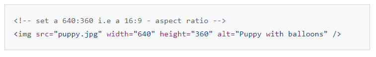
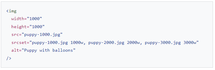
Remember the src or srcset attributes we looked at when talking about resource discovery? Well this is fairly pivotal to improving CLS scores.
For static images, set the width and height using the src attributes to tell the browser to reserve space for slower loading assets, thereby avoiding layout shifts.
See the example code from Google below:
Responsive images require an srcset to define the maximum width and height limits the browser can select. Ensure that you use images with the same aspect ratio.
Here’s another example:
When dealing with ads there are a few steps you can take:
Reserving static space is also advised if you intend to implement iFrames, embedded content and dynamic content, such as calls to action (CTAs).
When browsers download and render web fonts there’s a chance of either a flash of unstyled text (FOUT) or a flash of invisible text (FOIT) occurring. The former happens as a fallback font is swapped with a new font , while the latter is the result of a delay in a new font being rendered.
You can solve both problems by using <link rel=preload> to tell the preload scanner to grab the web fonts sooner. Preloaded fonts have a greater chance of meeting the first paint.
There are other solutions in Google’s CLS troubleshooting guide as well as its deep dive into using preload to prevent FOIT.
If you’re looking for site speed improvements and are still using a traditional single-server hosting option, then it’s probably time to consider switching to a content delivery network (CDN).
A CDN consists of a network of servers located at different data centers around the world that distribute website content to improve performance. While both a single server option — also known as local hosting — and CDN deliver website content to visitors, only a CDN can factor in the user’s geographical location and then pick the closest server to reduce load times.
Geography is not the only advantage, however, as CDNs are also better equipped to manage sudden traffic spikes as well as root server resources such as bandwidth.
Ultimately, a faster browsing experience sends a strong CWV signal to Google. While Cloudflare is one of the most well known CDN providers on the market, there are a number of serious competitors to consider.
Regardless of which hosting provider you use, their servers are going to be bound by certain hardware constraints.
Servers largely contain the same key components that allow your laptop/desktop to function — namely a CPU and RAM — which handle all your account’s tasks. You should be able to use your hosting provider’s dashboard to check the CPU and RAM installed on your server and even be able to request additional resources to boost your site’s performance.
If you are looking at your server’s CPU then it’s important to understand that only a single core is used to fulfill a visitor’s request for a web page. This means that faster single-core clock speeds are always an. Multi-cores CPUs are able to process multiple page views and other server services.
This is another one for your developer.
Review your database on a semi-frequent basis to ensure that it hasn’t become bloated with unused photos and files. Deleting unnecessary files will declutter it, speeding up average page load times.
Using really large images can and will slow your website down. How large? Anything over 1MB is simply too large.
And as we already know, slower load times will lead to higher bounce rates and send unwanted signals to Google.
For those on WordPress, there are a number of image optimization plugins to choose from that can streamline an otherwise tedious manual task. Moreover, many also come with other features such as lazy loading and auto-resizing.
Whether a site is mobile friendly or not revolves around whether you’ve simplified and streamlined your site for the mobile browsing experience.
Mobile users interact with pages differently and have much less patience for slow load times and hard to navigate sites. If your site has failed the mobile friendly test described above, or even if it’s passed but you’re interested in further optimization, then let’s go over some of the best practices.
This should be every publisher’s primary concern. A simple way to address ease of use is to ask yourself questions such as:
These answers will go a long way towards identifying user pain points. For example, you don’t want to make your users adjust their screens to view your content. You can see what we mean in the example below.

To optimize your content for mobile devices, there are three development options:
We’ve ordered them in terms of ease of implementation and we recommend adopting a responsive design, as it is the least demanding of the three options.
Developers simply add the meta name=”viewport” tag to a web page’s existing <head> code to allow the viewport to instruct the user’s browser to render the content to fit the screen size — be it a desktop, laptop or mobile device.
The advantage here is you only have to maintain one website, that can be displayed easily across any screen type.

By contrast, dynamic designs work by serving different HTML code based upon the user’s device. Pages need to use the Vary HTTP header to prevent the wrong code being served to the wrong device.
Finally, there are mobile subdomains, which we don’t advise given the amount of resources required to implement effectively. Mobile subdomains are completely separate sites which separate hosting needs. To ensure that crawlers understand the relationship between domain and subdomain, you’ll need to include the rel=”canonical” tag.
Because responsive designs is the simplest option it’s the one we recommend for publishers. For a closer look at responsive design, check out Google’s implementation guide.
Here’s a quick list of technical considerations for any design:
This last step is the simplest way of improving page experience, but also goes a long way to improving your user’s peace of mind.
Switching to HTTPS protects and encrypts your users’ information, it also helps to prevent Man in the Middle (MitM) attacks. On top of this, having a SSL certificate eliminates browser warnings about a lack of security.
Your hosting provider really should be able to provide you with HTTPS security, if it doesn’t then it might be worth considering a move to one that does. There are already several notable hosting providers that provide HTTPS free of charge. Moreover, those hosting providers that provide SSL certificates use their own service instead of the external one, making the process even easier and quicker to implement.
If you want to request and install an SSL certificate from Certificate Authorities (CAs), there are four steps you need to follow. These are:
It is important to make sure when migrating your site to HTTPS that it doesn’t impact your ad revenue strategy. The issue is that an HTTP <iframe> won’t work on a site using HTTPS.
We advise consulting with your ad tech partners before making any changes to your site.
For more details check out Google’s comprehensive guide on the subject.
Intrusive interstitial ads and dialog boxes make it hard for search engines to understand a web page’s content, which can undermine SERP performance.
It would be great if there was a way of creating interstitials that didn’t disrupt the user experience, but that’s the entire point of such ads. They take over the entire screen at breaks in content in order to gra the user’s attention.
As such, publishers would be better off using banner ads instead of interstitial ads, as they only take up a small portion of screen real estate. Better risking banner blindness than user frustration.
Publishers can use browser-supported banners or simple HTML banners that link to the CTA’s destination page.
Dialog boxes can also be used for promotional campaigns, but these can be designed to be unintrusive. You need to ensure users can access content without interruption.
There are no real shortcuts to optimizing your page experience and it’s vital that you fix the above points. With that being said, it’s worth pointing out that while WordPress is easily the most popular publishing platform in the world, this doesn’t necessarily mean it’s the best CMS when it comes to boosting CWV performance.
Looking at the CWVs Technology Report shows that only around 29% of WordPress websites have good CWVs, while 41% of Wix sites get the green tick.
It’s worth weighing up whether switching over to a specialized CMS could improve your CWVs natively.
There’s a lot of ground to cover when it comes to optimizing page experience and getting started can be a little daunting. However, it’s important to remember that you eat the elephant by taking one bite at a time.
Aiming for a “Good” score across all of your CWV metrics isn’t necessary to help your site climb the SERPs. More than that, however, setting such lofty goals can be counter productive as it can be a demoralizing pursuit.
Rather, aim for small wins when it comes to your CWVs, focus on addressing “Poor” results without overly worrying about the “Needs improvement” bar. That can come later, when you have more time and resources to dedicate to the process.
We’ve already spoken about Yahoo! JAPAN’s improved CLS score, let’s look at another couple of sites that we can learn some lessons from.
Indian daily The Economic Times, which serves more than 45 million monthly active users, slashed its CLS score by 250% from 0.25 to 0.09 and its LCP time 80% from 4.5 seconds to 2.5 seconds.
Between October 2020 and July 2021, the publisher trimmed LCP scores in the “Poor” range by 33%, while CLS values in the “Poor” range fell by 65%. These gains allowed The Economic Times to pass CWV thresholds across its entire origin while reducing overall bounce rates by 43%.
The publisher achieved this in a number of ways, with the first of these being to prioritize asset download priorities using Priority Hints. It also tackled Long Tasks, breaking up chunks of code to ensure that resources that are critical for above the fold page rendering were loaded first.
The UK news website improved its CLS score from 0.25 to 0.1, while increasing the number of URLs that received a passing grade from 57% to 72%.
The Telegraph used Chrome DevTools to identify individual instances of shifting layout.
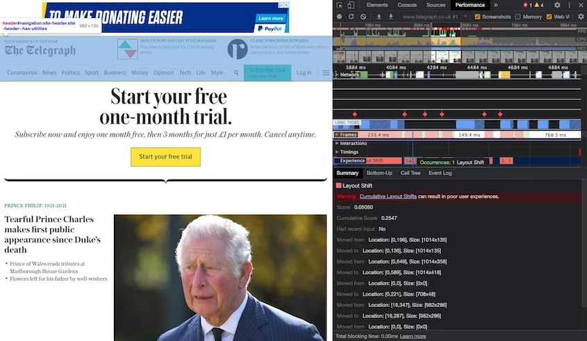
Before then using WebPageTest to find where in the timeline the layout shift occurred.
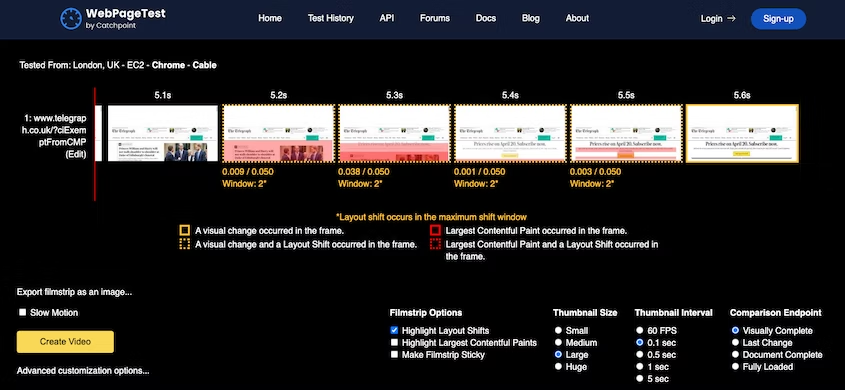
With this data in hand the team began focused on reducing layout shifts by tackling these areas
For adverts The Telegraphed began reserving space for them and used the most common advert size to specify dimensions. This also helped to stop ads from collapsing when viewed on a tablet.
The team tackled a similar issue with inline images at the top of the articles, which did not have specified dimensions.
The Telegraph made other adjustments, such as moving the header to the top of the markup and using placeholders for embedded videos, but ultimately described the process as “quite easy” while still having a significant impact.
Improving page experience doesn’t need to be overwhelming. Measure the four pillars of page experience and then decide what resources you can devote to improving your results.
If you’re a smaller publisher, resource balancing will be crucial and we’d recommend identifying reasonably low hanging fruit for your first project.
Looking at the Telegraph’s approach, they focused on one aspect of the CWVs rather than all three and made significant improvements. The Economic Times focused on two of the three to deliver some impressive results.